Reality Views by sm –
Thursday, July 15, 2010
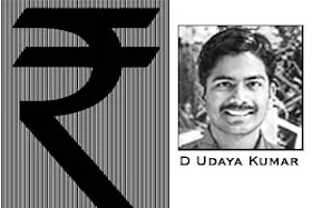
The five member panel has chosen IIT post-graduate D Udaya Kumar’s design from among five short listed symbols and recommended it for Cabinet approval.
Below is the photo of Indian Rupee symbol -

Kumar’s symbol is an amalgam of the Devanagari ‘Ra’ and the Roman capital ‘R’ without the stem
The Ministry had organized a symbol design competition with prize money of Rs 2.5 lakh with the condition that it should be applicable to the standard keyboard, be in the national language script or a visual representation and should represent the historical and cultural ethos of the country.
The basic aim of the new symbol is to provide the Indian rupee international recognition
In the global space, the unique sign will also help isolate the currency from the current abbreviation ‘Rs’ which is used by neighboring Pakistan, Nepal and Sri Lanka.
Kumar’s concept is based on the Tricolor and “arithmetic equivalence”.
While the white space between the two horizontal lines gives the impression of the national flag with the Shook Chakra, the two bold parallel lines stand for ‘equals to’, representing balance in the economy, both within and with other economies of the world.
In future All new Indian notes will now bear the symbol.
Suggested Reading -
How to use Indian Rupee Symbol ` in Microsoft office or Open office?
http://realityviews.blogspot.com/2010/07/how-to-use-indian-rupee-symbol-in.html
Good symbol ...
ReplyDeleteIts good to have a symbol of our rupee ...
दिगम्बर नासवा,
ReplyDeletethanks
very nice symbol.. and thanks for sharing!!
ReplyDeleteWow.. That was a quick post! I just saw this on the news. Yep, I like the symbol. It stands for something Indian which is good.
ReplyDeletesm, I really think the new rupee symbol is very nice. It is bold and stands out well. Mr. Kumar did an excellent job - and, by the way, he is most handsome...he could be a Bollywood star, I think but, perhaps,he has no talent. From some of the movies I've seen, though, some of them are not so talented, either!
ReplyDeleteIt is good to have a symbol. Instead of writing Rs. one can use the symbol now.But we have to get used to this drawing now.
ReplyDeleteSwatantra,,
ReplyDeletethanks
lostworld,
ReplyDeletethanks
RNSANE,,
ReplyDeletethanks
chitra,,
ReplyDeletethanks
I don't like the line on top :( There was another symbol without the line on top which would have been easier and quicker to draw, but I guess a lot of people like this one. How do we type this one? Will we be able to download it as a font?
ReplyDeleteIndian Home Maker,,
ReplyDeletethanks.
One big step forward..I feel very happy.
ReplyDeleteSamvedna,,
ReplyDeletethanks.
I feel that symbol is difficult to use but we will get to use it.
Its nice to have a symbol. Waiting for it to come on the standard keyboard!
ReplyDeleteInsignia,,
ReplyDeletethanks